

We offer financial wings
to let your dreams soar higher
Lorem ipsum dolor sit amet, consectetur adipiscing elit. Ut dolor urna
159%
Lorem ipsum dolor sita

Lorem ipsum dolor sitam consectetur adip

Companies we worked with


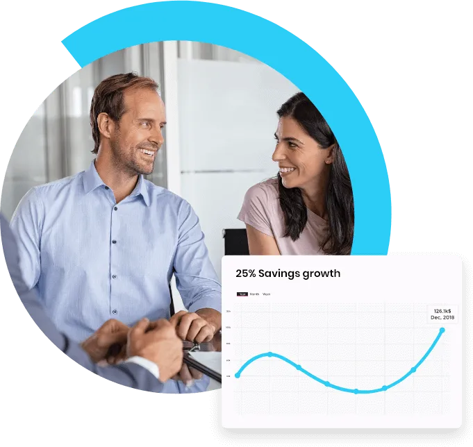
We have a commitment to your future
We offer financial wings to let your dreams soar higher
Lorem ipsum dolor sit amet, consectetur adipiscing elit. Ut dolor urna, sollicitudin eget felis id, ultricies eleifend arcu. Duis gravida sagittis mi, sed finibus libero sodales ac. Suspendisse potenti. Nunc commodo eu erat sed pharetra. Nam id mattis leo. Fusce consequat tempus semper.


Lorem ipsum dolor sitam consectetur adip
We are here to help you get your financial share of the pie
Lorem ipsum dolor sit amet, consectetur adipiscing elit. Ut dolor urna, sollicitudin eget felis id, ultricies eleifend arcu. Duis gravida sagittis mi, sed finibus libero sodales ac. Suspendisse potenti. Nunc commodo eu erat sed pharetra. Nam id mattis leo. Fusce consequat tempus semper.
Nunc commodo eu erat sed pharetra. Nam id mattis leo.
Fusce consequat tempus semper.
Duis gravida sagittis mi, sed finibus libero sodales

We offer financial wings to let your dreams soar higher
Lorem ipsum dolor sit amet, consectetur adipiscing elit. Ut dolor urna,
20+
Consectetur Adipisc

120+
Consectetur Adipisc
67K
Consectetur Adipisc
100M
Consectetur Adipisc
We are here to help you get your financial share of the pie
Lorem ipsum dolor sit amet, consectetur adipiscing elit. Ut dolor urna, sollicitudin eget felis id, ultricies eleifend arcu. Duis gravida sagittis mi, sed finibus libero sodales ac. Suspendisse potenti. Nunc commodo eu erat sed


Phasellus Vitae Dapibus
Lorem ipsum dolor sit amet, consectetur adipiscing elit. Ut dolor urna, sollicitudin eget felis id, ultricies eleifend arcu. Duis gravida sagittis mi, sed finibus l
Duis Gravida Sagittis Mi, Sed Finibus
Lorem ipsum dolor sit amet, consectetur adipiscing elit. Ut dolor urna, sollicitudin eget felis id, ultricies eleifend arcu. Duis gravida sagittis mi, sed finibus l

Max Tanner

Lorem ipsum dolor sit amet, consectetur adipiscing elit. Quisque nisi nunc, tincidunt non nibh non, ullamcorper facilisis lectus. Sed accumsan metus viverra turpis faucibus, id elementum tellus suscipit. Duis ac dolor nec odio fermentum

Max Tanner
Lorem ipsum dolor sit amet, consectetur adipiscing elit. Quisque nisi nunc, tincidunt non nibh non, ullamcorper facilisis lectus. Sed accumsan metus viverra turpis faucibus, id elementum tellus suscipit. Duis ac dolor nec odio fermentum
Hear From Our Clients
We offer financial
wings to let your
dreams soar higher
Lorem ipsum dolor sit amet, consectetur adipiscing elit. Quisque nisi nunc, tincidunt non nibh non, ullamcorper facilisis lectus. Sed accumsan metus viverra turpis faucibus, id elementum tellus suscipit. Duis ac dolor nec odio fermentum

Read Our Newest Blogs

10 Rules of Thumb in UI Design
When in doubt, here’s a list of standard practices to follow in UI design.
None of these are set in stone — simply a list of methods that I believe can help you in your day to day UI design work.
Remember, design is all about thinking outside the box, and sometimes that means breaking the rules — so take this advice with a grain of gourmet Himalayan sea salt.
1. Design for density, not pixels
pixel values are 3 or 4x the dp values
If you’re unfamiliar, density is the number of pixels per one inch of a screen or PPI. The unit “dp” is short for “density-independent pixel,” also sometimes abbreviated as “dip.”
When designing an interface, it’s recommended that we don’t design for pixels, but rather for the pixel density of the device. This ensures that our elements are scaled properly to fit different device sizes.
The reason we do this is so if we design a button asset, for example, at 200 x 50 dp, it’s displayed at 200 x 50 px on a 160ppi screen and 400 x 100 px on a 320 ppi screen, or 2x the size of the original asset.
Since some screens have more pixels per inch than others, the assets aren’t displayed smaller on screens with a high pixel density, they’re merely rendered at 2x, 3x, 4x their original size. This makes sure that all assets maintain their sizing across different devices with varying densities.
The dimensions for the iPhone XS Max’s screen, for example, is 414 x 896. But that’s not pixels, that’s the number of points. In pixels, it’s 1242 x 2688 px. With that in mind, when designing for the iPhone XS Max, I would design at 414 x 896 points and then deliver assets @ 3x.
2. Use 8dp increments
Why design with spacing in increments of 8? Well, there’s a simple explanation for this; The reason we use the magic number 8 as opposed to 5, for example, is that if the device has a 1.5x resolution, it won’t render an odd number properly.
Additionally, the vast majority of modern screen dimensions are divisible by 8, making it simple to align our designs appropriately on those devices.
By designing in increments of 8 on an 8-point grid, it creates consistency in our designs. There is no more guesswork for spacing, and everything is aligned perfectly with the spacing conventions that we’ve defined.
For a more comprehensive read on this topic, check out Bryn Jackson’s 8-Point Grid article.
3. Remove lines and boxes
When designing, you should take a step back at times and decide whether having containers is cluttering the UI or not. Often, boxes and lines serving to divide content could be replaced with margin.
Most elements that we design are contained within boxes, so by simply removing those containers, it can make the page seem less dense and give our elements more room to breathe.
4. Pay attention to contrast
Using contrast not only draws the user’s eyes to relevant information on the page, but it also improves the accessibility of the product.
Designing a product is similar to building a public building like a library or a school — it needs to be inclusive to all. That includes blind, color blind, and visually impaired users.
Web Content Accessibility Guidelines (WCAG) requires at least 4.5:1 contrast.
To ensure you’re meeting this standard, download Stark which will allow you to check if your designs are accessible or not.
5. Familiarity is good
There are numerous reasons why certain elements are considered standard.
For example, if you’ve designed your button to be a circle, then when the text needs to be “Start Free Trial,” for instance, it will take up an unnecessary amount of vertical space.
Aside from that, users have come to expect similar experiences across the web. If your website, app, or software functions differently than what users have grown accustomed to, then it won’t be intuitive, and they will likely become frustrated with the experience.
For this reason, it’s best to be creative only within the confines of the current norms in design. Don’t re-invent the wheel.
6. Use color weight to establish hierarchy
Every color has a visual weight, which can help us to develop a hierarchy among our content. By using lighter hues of color, we can assign different levels of importance to elements.
The rule of thumb here is that if an element is more important than another, it should be of a higher visual weight. This makes it easy for a user to quickly skim the page and distinguish between the important and less important information.
The bigger, bolder information is what the user’s eyes will be drawn to first, and then they will move on to the supporting information below it.
7. Avoid using more than two typefaces
A generally accepted design practice is to limit the number of fonts used in an interface. Generally, two different typefaces should be enough. That doesn’t mean you can’t use more, but unless you have a good reason, it’s usually better not to.
The way around this is to use font families.
By using a font family, we can use the same font with different variations in our designs. Fonts from the same family are designed to work together, so they’re flexible and consistent.
When selecting a font, find families that have various weights like light, regular, medium, bold, extra bold, as well as styles like condensed, expanded, and italic. This will give you more room to explore different styles without adding additional typefaces.
8. Recognition, not recall
Recognition is a good practice in product design because, why make the user think?
Checkout pages, email inboxes, search history, back buttons, etc. are all good examples of this.
On a checkout page (if designed well), I shouldn’t have to remember what items I am paying for. I should clearly be able to identify the items that I’m purchasing without having to jog my memory.
dis what I search
In my Gmail inbox, at a glance, I can determine which emails I’ve read and which ones I haven’t without having to think about it. Or, if I log in to Amazon, I can quickly pick up where I left off because it will tell me the items that I recently viewed.
“Minimize the user’s memory load by making objects, actions, and options visible. The user should not have to remember information from one part of the dialogue to another. Instructions for use of the system should be visible or easily retrievable whenever appropriate.” — Nielson Norman Group
9. Don’t slow me down
The ultimate guide to proper use of animation in UX
As a user, speed and efficiency are the only things that matter. I’m using an application to solve a specific job to be done.
“I wanna go fast” — Ricky Bobby
If the experience of digitally depositing a check into my bank account is enjoyable, then that’s great, but don’t let your creativity get in the way of my objective as a user.
A good rule of thumb primarily pertaining to animations and micro-interactions is that if the experience adds unnecessary time, then it’s not improving the experience.
Being purposeful with animations can improve the experience, but adding unnecessary distractions and movement to elements will not.
I often see designs on Dribbble for landing pages that animate as the user scrolls through the page. It’s oftentimes overly animated with everything fading and moving, with little attention being paid to the experience itself. As a user, it can be challenging to know what I should pay attention to when so much is happening on the screen. It’s also wasting my precious time.
Sorry to call you out Dribbble user :/
“Numerous researches have discovered that optimal speed for interface animation is between 200 and 500 ms. These figures are based on the particular qualities of the human brain. Any animation shorter than 100 ms is instantaneous and won’t be recognized at all. Whereas the animation longer than 1 second would convey a sense of delay and thus be boring for the user.” — The ultimate guide to proper use of animation in UX
So the two parts to this are, if you’re using animation — be purposeful about it. And if those animations are purposeful, then don’t make me wait more than 500ms. In 2019 it only takes a millisecond to peeve your users.
10. Less is more
lmk if you wanna invest in this revolutionary idea
Every time we add additional information to the page: buttons, text, images, animations, illustrations, etc., it competes with the relevant information. If there is too much on a page, then the importance of elements diminishes.
A perfect example of this is the famous Google homepage. Instead of inundating the visitor with possibly unnecessary information, the design remains focused on the primary action: search.
Sorry Yahoo, had to do it to ya
One of my favorite design quotes: “Perfection is achieved, not when there is nothing more to add, but when there is nothing left to take away.” — Antoine de Saint-Exupery
——
👋 Let’s be friends! Follow me on Twitter and Dribbble and connect with me on LinkedIn. Don’t forget to follow me here on Medium as well for more design-related content.


© 2022 Company Name - All Rights Reserved, consectetur adipiscing elit. Maecenas commodo suscipit tortor, vel tristique sapien
Contact


